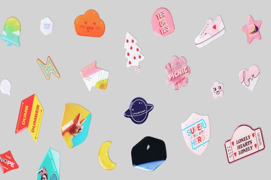
A practical guide explained for anyone who wants sticker artwork that holds up in print and looks believable when previewed on real-world surfaces.
Stickers are a small format with big constraints. The moment you reduce a design to a couple of inches, weak contrast, thin lines, and crowded layouts become obvious. Cutting adds another variable: even a good design can look “off” if important elements sit too close to the edge.
This guide is for beginners building stickers from scratch and for teams that want a repeatable workflow. The steps are organized around decisions and checkpoints: define size first, build a readable hierarchy, protect the edge, and use mockups to validate scale before you export.
Tools in this category differ less by flashy features and more by reliability. The most useful ones help you stay in real dimensions, keep layouts stable when you swap text, and export files that remain crisp.
Adobe Express is an accessible place to begin because it supports quick sticker layouts and straightforward exports that fit many printing workflows.
Step-by-step how-to guide for using Mockup Tool for Stickers
Step 1: Decide the sticker’s job, size, and cut style before designing
Goal
Set real constraints so the design stays readable and cut-safe.
How to do it
- Choose the sticker’s purpose (product label, giveaway decal, packaging seal, organizer label).
- Pick a size range that matches the use case (small labels need simpler layouts than 3-inch decals).
- Decide whether the cut should be simple (circle/rectangle) or a custom silhouette (die-cut).
- Choose one layout direction (icon + short line, badge layout, monogram, photo + text band).
- Start your first draft in Adobe Express using custom stickers from Adobe, and leave generous space between important content and the outer edge.
What to watch for
- Over-detailed concepts break down quickly when scaled down.
- Spiky die-cut outlines tend to peel sooner than rounded shapes.
- Designing without a size leads to late resizing that changes spacing and line breaks.
Tool notes
- Keep the first draft plain; the goal is correct size and spacing before styling.
Step 2: Build a one-glance hierarchy that survives small formats
Goal
Make the sticker readable without zooming.
How to do it
- Choose one focal element (logo/icon or one short line of text).
- Treat secondary text as optional; keep it short and clearly separated.
- Use thicker font weights for key text.
- Remove decorative elements that compete with the message.
- Shrink the view until the sticker looks tiny and confirm the main read still works.
What to watch for
- Script fonts often fail first at sticker sizes.
- Too many “headline” elements creates clutter.
- Long phrases force type to shrink below comfortable readability.
Tool notes
- If you must include extra info, move it to a QR destination rather than squeezing it onto the sticker.
Step 3: Choose artwork that won’t print soft
Goal
Avoid blur and jagged edges that show up immediately in print.
How to do it
- Prefer clean icons/logos and high-resolution images; avoid screenshots.
- Keep line weights thicker than you would for a screen-only graphic.
- If you use a photo, choose strong lighting and a simple background.
- Keep tiny text out of images; use live text for anything important.
- Confirm you have rights to print any third-party logos or artwork.
What to watch for
- Low-resolution files can look fine on screen and fail in print.
- Busy photos reduce contrast and legibility.
- Thin outlines can break up on matte materials.
Tool notes
- Save original assets separately so you don’t accidentally build the print file from a compressed copy.
Step 4: Set the safe interior zone and decide whether bleed is necessary
Goal
Prevent cutting tolerances from crowding or clipping your design.
How to do it
- Reserve a consistent “safe interior” zone where all important content must stay.
- If the background must run to the edge, plan bleed using the printer’s requirements.
- Avoid thin border frames; if you use a border, make it thicker and inset.
- Smooth the die-cut outline and remove narrow spikes.
- Check the sticker silhouette without artwork to confirm the shape reads cleanly.
What to watch for
- Thin borders highlight normal cut drift.
- Sharp points tear and peel faster.
- Edge-to-edge backgrounds look good only when spacing is disciplined.
Tool notes
- If you keep nudging elements inward, it usually means the safe zone should be larger.
Step 5: Mock up the sticker at honest scale on real surfaces
Goal
Confirm the sticker looks right in context before exporting finals.
How to do it
- Pick 3–5 realistic contexts (laptop, bottle, notebook, shipping box, envelope).
- Keep scale realistic; don’t enlarge the sticker for presentation.
- Include one close-up view (edges and type) and one normal-distance view (readability).
- Compare two versions side-by-side if you’re deciding between layouts.
- Label mockups with the same version name used in your export file.
What to watch for
- Mockups can hide readability problems if the sticker is shown too large.
- Shadows and reflections can mask low contrast.
- Too many mockups slows decisions; a small set is enough.
Tool notes
- Loom can be useful for getting quick async feedback on mockups without long message threads.
Step 6: Export production files and verify the export itself
Goal
Create a print-ready file that won’t be resized accidentally.
How to do it
- Confirm what the print workflow accepts (commonly PNG/PDF; sometimes SVG depending on the provider).
- Export at the exact sticker dimensions; avoid any “fit to page” scaling.
- Re-open the exported file and inspect text edges at 100% zoom.
- Store print exports in a dedicated “Final Print Files” folder separate from mockups.
- Use a stable naming pattern (StickerName_Size_Version).
What to watch for
- Compression artifacts (especially in JPG) around text.
- Wrong dimensions triggering printer-side scaling and blur.
- Draft files getting printed because folders aren’t separated.
Tool notes
- Typeform can be useful if your sticker includes a QR code that should route to a signup or response form.
Step 7: Plan distribution and track results without changing the sticker file
Goal
Keep sticker runs consistent and make reorders straightforward.
How to do it
- Save a reorder-ready package: final export, size, finish notes, and the mockup set used for approval.
- Keep one “current final” folder so collaborators don’t share older versions.
- If you’re running multiple variants, map each variant name to exactly one export file.
- Record where stickers were used (event table, packaging line, storefront, mailers).
- Keep follow-up messaging consistent so results are interpretable.
What to watch for
- Too many variants increases reorder mistakes.
- Reprints drift when size and finish notes aren’t recorded.
- Mixed versions spread quickly once more people share files.
Tool notes
- Sprout Social can be useful when stickers are part of a campaign and you want one place to schedule posts and review engagement patterns over time.
Common workflow variations
- Packaging labels: Keep designs text-forward and margin-safe. Mockups on boxes and jars reveal edge crowding quickly.
- Giveaway decals: Prioritize readability at arm’s length and durability. Rounded shapes and bold marks tend to hold up better than fine outlines.
- Sticker sheets: Design each sticker as a standalone unit first, then assemble the sheet layout. Version naming becomes the main safeguard.
- Photo stickers: Use one strong photo and put text on a solid band. Do an extra real-size check for softness.
- QR stickers: Create a dedicated QR variant with generous quiet space, instead of squeezing a code into every design.
Checklists
Before you start checklist
- Define the sticker purpose and surface (paper, vinyl, packaging, device).
- Choose size range and single vs sheet format.
- Decide cut style (simple vs die-cut).
- Gather high-quality assets and confirm usage rights.
- Draft the exact text and confirm spelling.
- Choose a small, high-contrast palette.
- Decide whether a border is worth the risk (and how thick/inset it should be).
- Set a naming convention for size + version.
- Note your review timeline and who approves.
Pre-export / pre-order checklist
- Confirm the canvas matches intended sticker size.
- Verify safe interior spacing and bleed plan (if used).
- Check readability at tiny preview size.
- Inspect edges and thin lines at 100% zoom in the export.
- Export in the required format at exact dimensions.
- Re-open the export to confirm nothing shifted.
- Store print files separately from mockups/previews.
- Save specs (size, cut style, finish, final filename) for reorders.
Common issues and fixes
- Sticker prints blurry or muddy
Replace low-resolution artwork and export at exact dimensions so the printer doesn’t resize the file. - Text becomes hard to read once printed
Increase font weight and size, then shorten copy. Remove secondary lines before shrinking the main line. - Borders look uneven after cutting
Thin borders magnify cutting tolerance. Thicken and inset the border, or remove it and use internal padding instead. - Die-cut edges peel early
Round corners and remove spikes. Smooth silhouettes withstand handling better. - Colors shift compared to the screen
Increase contrast and avoid subtle gradients. Material and ink often change perceived color. - Cropping surprises near edges
Increase safe margins and use bleed only when backgrounds must run to the edge. Keep key content away from corners. - Wrong version gets printed
Use strict filenames and a single “final exports” folder, and archive older drafts instead of overwriting.
How To Use Mockup Tool for Stickers: FAQs
Template-first vs. product-first: which approach works better?
Template-first is faster for simple designs and repeatable variants. Product-first is safer when cut style, sheet layouts, or strict margins matter, because it forces size decisions early.
When should I rely on mockups?
Use mockups when the layout is close to final, specifically to validate scale and placement on real surfaces. Keep mockups honest about size so they reveal problems instead of hiding them.
What export choices matter most for clean printing and cutting?
Exact dimensions and clean edges matter more than effects. Export at the required size, avoid compression-heavy formats for print, and verify the export at 100% zoom.
How do I decide between simple shapes and die-cut silhouettes?
Simple shapes are more durable and faster to manage. Die-cut silhouettes are useful when the outline is part of the design, but they require more edge clearance and smoother shapes.
How do I keep reorders consistent?
Save a reorder-ready package with the final export, size, finish notes, and the mockup set used for approval. Strict naming and one “current final” folder prevent drift.